10 Best Product Analytics Dashboard Shortlist
Here's my pick of the 10 best software from the 18 tools reviewed.
Our one-on-one guidance will help you find the perfect fit.


With so many different analytics solutions available, figuring out which one is right for you is tough. You know you want to present complex product data in a clear and accessible manner, allowing teams to quickly understand how customers use your products and make informed decisions but need to figure out which tool is best. I've got you! In this post I'll help make your choice easy, sharing my personal experiences using dozens of different tools with large teams and diverse products, with my picks of the best product analytics dashboards.
What are product analytics dashboards?
A product analytics dashboard is a digital display that aggregates and visualizes key performance indicators (KPIs) and metrics related to a product's usage and effectiveness. These dashboards provide a centralized view of product data, enabling teams to track and understand how users interact with the product.
They primarily achieve this through customizable data visualizations, real-time data updates, segmentation capabilities, and integration with various data sources.
Overviews Of The 10 Best Product Analytics Software Solutions
Here’s a brief description of each product analytics dashboard solution to showcase each tool’s best use case, some noteworthy features, and screenshots to give a snapshot of the user interface.
Miro
Best for real-time collaboration and visualization of product analytics data

Miro is an online whiteboard platform that supports teamwork in brainstorming, planning, and designing by keeping everyone on the same page.
Miro distinguishes itself with an infinite canvas for extensive project mapping and an integrated video chat for direct communication. The platform also accommodates diverse idea expressions, including numerical, image-based, or video formats, and offers tools for quickly adapting diagrams and charts. TalkTrack recordings additionally allow for asynchronous process explanations, enhancing collaboration. Miro integrates smoothly with major workplace tools like Notion, Confluence, Asana, and Monday.com, making it a practical choice for product analytics dashboards.
The software also integrates with other workplace tools like Zoom, Microsoft Teams, Slack, Google Workspace, Asana, monday.com, Jira, Dropbox, OneDrive, Notion, Airtable, ClickUp, and Unito, among others.
A free plan is available and paid plans start from $10 per user per month.
Product analytics dashboard with a session replay feature

Quantum Metric is a product analytics tool for improving products by gathering data from customers’ behavior in-app. It has alerts that notifies you of critical customer actions, like delay or frustration using a specific feature. Quantum Metric offers page analytics for isolating detractors and promoters and the features that drive them.
Quantum Metric is the best product analytics dashboard with a session replay feature for recreating how customers use your site or app. This feature allows you to see the challenges or errors customers encounter so you can improve underperforming pages.
You can use Quantum Metric to capture specific timeframes and share them with team members. Session replays also capture the metadata behind the replay, like user platform or network details and other factors that may have affected customer experience.
Quantum Metric pricing and a free demo are available upon request.
Product analytics dashboard with predictive analytics

Google Analytics is a product analytics dashboard for understanding how people use your app or website. You can use it to find insights about user demographic trends or changes in customer behavior. It has a reporting feature for the real-time monitoring of activities on your site or app.
Google Analytics is the best product analytics dashboard if you want to know how customers will act in the future because of its predictive capabilities. You can use Google Analytics to determine which customers are in danger of churning or who might be susceptible to an upsell. The tool lets you group information according to users, purchasing actions, and/or app usage and build marketing plans around that data.
Google Analytics integrates with other Google solutions like Google Ads, Google Cloud, Google Play, and Google Ad Manager.
Google Analytics has a free version and they offer a paid version with tiered pricing that’s available upon request.

UXCam is a product analytics dashboard for mobile applications. It has a screen flow feature to see how customers engage with your mobile app and identify drop-off points that could be better optimized. UXCam uses machine learning to analyze the user experience and automatically uncover issues your product team might have missed.
UXCam is the best product analytics dashboard for identifying features or layouts that cause customer frustration with the help of its heatmaps. This helps identify customer behavior within the app to pinpoint design elements you can improve upon. Click heatmaps also enable you to identify features that customers frequently use and use them as selling points to attract new users.You can connect your EXCam to a paid Zapier account to access premium apps and tools.
UXCam has a free version with limited features for up to 10,000 sessions per month.
Pricing details for paid plans are available upon request. They offer a 14-day free trial for paid plans.
Mixpanel
Product analytics dashboard with custom real-time alerts feature

Mixpanel is a business analytics platform for tracking user interactions to improve engagement and retention. It has an insight reporting feature to see popular features and how they affect customer conversion. You can connect Mixpanel to a data source or data warehouse to analyze business intelligence from various sources. It has interactive dashboards your team can use to monitor metrics and key performance indicators.
You can use Mixpanel to uncover the paths that loyal users take to improve conversion rates. The feature also lets you identify high-performing segments and the features customers find attractive. The tool identifies the features customers use that resulted in churn so your product team can improve them.
Mixpanel also lets you re-engage potential churn customers to convert them with improved features.You can integrate Mixpanel with a data warehouse or product analytics tools like Google Cloud, AB Tasty, Amazon Web Services, and Apptimize.
Mixpanel has a free plan with limited features for up to 100,000 monthly tracked users. Pricing for the paid plans starts at $20/month/account.
Product analytics dashboard for measuring customer engagement

Amplitude is a product analytics software for tracking user behavior and gaining insights into product improvement opportunities. This data analytics tool has a “milestone analysis” feature that determines the key factors that lead to customers making high-value actions, like buying into upsell opportunities or upgrading their product subscriptions.
Amplitude is the best product analytics dashboard for measuring net promoter score (NPS) without using the typical self-report surveys, which can be unreliable. This tool lets you track user behavior while using your product, such as customers signing up for an account or completing a purchase. Amplitude can also help you improve retention rates by identifying pain points of churn victims.
Amplitude has a free forever plan with limited features. Pricing for paid plans and a free demo is available upon request.

Pendo is a product adoption platform used by companies like Cisco, Marketo, Zendesk, ADP, and OpenTable, to name a few. It lets you create tooltips or walkthroughs to promote seldom-used but valuable features. You can also use Pendo to set retention goals, track active accounts, watch adoption trends, and report on user behavior.
Pendo is the best product analytics dashboard if you want to address product analytics data with in-app wikis, resources, and self-help modules. Pendo helps you identify customer needs and pain points and then gives you space to build out comprehensive walkthroughs to guide customers through these areas with ease.
Pendo integrates with other product analytics tools like G2 Reviews, Twilio Segment, and Fullstory.
Pendo has a free version with limited features for up to 1,000 active monthly users, and they provide pricing information for paid plans and a free demo upon request.

Heap is a digital insights platform to monitor what is happening in your product, app, or website and how these events affect your revenues. It has interactive dashboards to keep all team members aligned toward achieving the same core metrics and goals. This product analytics tool has a built-in performance monitoring feature to alert you upon detecting fluctuations in KPIs.
Heap is the best product analytics dashboard if you want to identify behaviors that signify long-term value and improve product adoption. Heap can help you isolate and eliminate features that prevent users from adopting your product. You can then use this product analytics software to create a roadmap for customers with product adoption and activation in mind.
Heap integrates with other tools, including Marketo, Intercom, Optimize, and Salesforce.
Heap is a free product analytics tool for up to 10,000 sessions and one project per month.
For paid plans, they offer pricing details upon request, as well as a 14-day free trial or free demo.

Creabl is a customer experience tracking software that helps businesses understand how users navigate their website, what drives them to purchase their product or service, and the success factors that contribute to customer retention. The software records website sessions and produces heatmaps of how visitors navigate various web pages. It can also be used to create custom funnels to track how visitors convert into leads and paying customers. Finally, it tracks user onboarding and feature adoption to give product teams a better understanding of success factors for new customers.
The software's retention tracking module provides both a table and linear view of various customer data. It facilitates cohort analysis and custom segmentation to help you drill down into the customer groups that mean the most to your business model and strategy. Users can create custom activities in the software to best match their conversion funnels and product features, giving a more personalized overview of customer success.
Users who sign up for an annual payment plan can access the software from $36/month. A 30-day free trial is available.

InnerTrends is a product analytics dashboard for monitoring metrics throughout a customer journey. It has pre-built reports to help you save time collecting data about product usage and value.
InnerTrends’ pre-built reports have recommendations to help you visualize product feature impacts and conversion results. This product analytics platform lets you initiate account-based analysis to understand client value across their lifetime.
InnerTrends is the best product analytics dashboard with a cohort analysis feature for understanding how customer segments use your product. You can use cohort analysis to group users based on shared traits like newly onboarded accounts or geographic area. You can then monitor and analyze customer actions to pinpoint unused or overused features according to target audience type.
InnerTrends integrates with other product analytics tools like Google BigQuery, Rudderstack, and Segment.InnerTrends has a free forever plan with limited features.
Pricing for the paid plans starts at $79/month/user. They also offer a 14-day free trial.
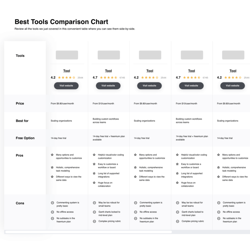
The Best Product Analytics Dashboards Pricing Chart
Here is a table where you can compare the tools we just covered in the overviews.
| Tools | Price | |
|---|---|---|
| Miro | From $10/user/month | Website |
| Quantum Metric | Pricing upon request | Website |
| Google Analytics | Free to use | Website |
| UXCam | Pricing upon request | Website |
| Mixpanel | From $20/month | Website |
| Amplitude | Pricing upon request | Website |
| Pendo | Pricing upon request | Website |
| Heap | Pricing upon request | Website |
| Creabl | When paid annually, Creabl’s Pro plan starts at $36 per month. | Website |
| InnerTrends | From $79/month/user | Website |
Compare Software Specs Side by Side
Use our comparison chart to review and evaluate software specs side-by-side.
Compare SoftwareOther Product Analytics Dashboard Options
Here are a few more product analytics tools that didn’t make the top list.
- LogRocket
Product analytics dashboard with revenue and funnel insights
- Zoho Analytics
Product analytics dashboard with an AI assistant feature
- SimilarWeb
Web analytics SaaS for understanding your competitor’s web traffic and performance.
- Tableau
Visual analytics platform for analyzing business intelligence.
- Hotjar
Product experience tool to discover user needs using heatmaps.
- dragonboat
Product portfolio management software for strategizing, prioritizing, delivering, and improving products
- Matomo
Web analytics software for generating reports on your website and its users.
- Open Web Analytics
Free and open-source web analytics for tracking how people use your website.


Comparison Criteria
What do I look for when I select the best product analytics dashboard tools? Here’s a summary of my evaluation criteria:
- User Interface (UI): A product analytics dashboard needs to have a clean user interface so users can find the feature they need quickly.
- Usability: Users without an analytics background will be using the product analytics dashboard, so I look for software that any team member can master.
- Integrations: Product teams use other product development tools, so I look for software that will work with them.
- Value for Pricing: I look for software with many features at a reasonable price.
Product Analytics Systems: Key Features
- Session replay: Records and replays user sessions to understand how users interact with your products.
- Interactive dashboards: Gives users a glimpse of critical metrics and KPIs for easier monitoring.
- Cohort analysis: Allows product teams to group users to understand how different demographics use a product.
- Predictive analytics: The ability to predict how users will act in the future according to how they interact with your product.
What Do You Think About This List?
A product analytics dashboard can help you understand how customers use your products so you can leverage useful features and improve features that customers ignore. You can use the software to gain insights into why customers are not converting so you can implement product improvements to improve conversion rates and generate more revenue.
There are other software and tools you can use to gain more customers and improve your company’s financial health, and you can read about them when you subscribe to The Product Manager.
Related Read: Notable Product Analytics Certification & If They’re Worth It
Related List of Tools:
- User Tracking Software
- User Behavior Analytics Tools
- Status Dashboard Software
- Visual Reporting Tools For Product Data
- Kanban Tools For Product Management
Also Worth Checking Out: