10 Visual Reporting Tools Shortlist
Here's my pick of the 10 best software from the 17 tools reviewed.
Our one-on-one guidance will help you find the perfect fit.


With so many different visual reporting solutions available, figuring out which is right for you is tough. You know you want to translate complex data sets into clear, visually engaging presentations that allow you to extract user insights in an instant but need to figure out which tool is best for the job. I've got you! In this post I'll help make your choice easy, sharing my personal experiences using dozens of different tools with large teams and diverse projects, with my picks of the best visual reporting tools.
What are visual reporting tools?
A visual reporting tool is a software application that helps users create graphical representations of data for reporting and analysis purposes. These tools facilitate the transformation of raw data into meaningful visuals, enhancing the understanding of trends, patterns, and insights. The features that make these tools great at representing data are customizable charts and graphs, real-time data updates, integration with various data sources, and interactive elements for exploration.
These tools let product managers simplify complex data sets, illustrate trends, patterns, and correlations, and create shareable reports for stakeholders.
Overviews Of The 10 Best Visual Reporting Tools and Software
Here’s a brief description of the best reporting tools to showcase each tool’s best use case, some noteworthy features, and screenshots to give a snapshot of the user interface.
Segment comprehensive business intelligence data according to any criteria
Zoho Analytics is a cloud-based business intelligence platform with an emphasis on visual reporting. It helps product managers answer key questions about their products by using interactive dashboards and reports that make exploring data easy. Users can connect to databases, spreadsheets, cloud applications, and even social media sources to pull in the data they need for analysis. The platform then serves as a hub for organizing and displaying this information visually appealingly. It offers several interactive visualization options that simplify comparing results side by side. This helps product managers get an accurate picture of how different factors impact their products without having to wade through complex spreadsheets or guess what might be causing certain outcomes.
One of the unique features of Zoho Analytics is its ability to drill down into data sets easily. Users can group or segment their data according to any criteria they choose. Zoho allows users to create visual reports in minutes using drag-and-drop tools. These reports are then customizable, allowing users to customize colors, fonts, and sizes. Users can also set up automated email notifications for when certain criteria are met, or certain actions take place. Zoho also allows users to perform sophisticated analyses of their product data. This includes analyzing sales trends over time and segmenting customers by location or other demographic information. This allows businesses to gain insight into customer behavior and identify areas where they could be improving or needing improvement.
Integrations include Microsoft Office 365, Microsoft Teams, Google Drive, Zendesk, and ServiceNow. Integrations via Zapier and Zoho Flow are also supported. Being part of the Zoho ecosystem allows you to connect to several of Zoho’s own services for Sales, Marketing, CRM, customer service, and more.
Zoho Analytics costs from $24/month and offers a 15-day free trial.

Tableau is a business intelligence and data analysis solution. The tool helps you collect data from multiple sources and create collective datasets you can share with coworkers in real-time.
One of the good things about this platform is that it enables you to create a narrative around your data analysis. You can map out each data source and create custom dashboards and reports to make the information accessible for people who don’t deal with data on a regular basis.
Tableau’s data prediction tools help you plan future projects with accuracy, and its community of users share great templates and offer suggestions.
Tableau costs from $70/user/month. You can access a 14-day free trial.
Adverity
Start analyzing your marketing performance with adaptable templates
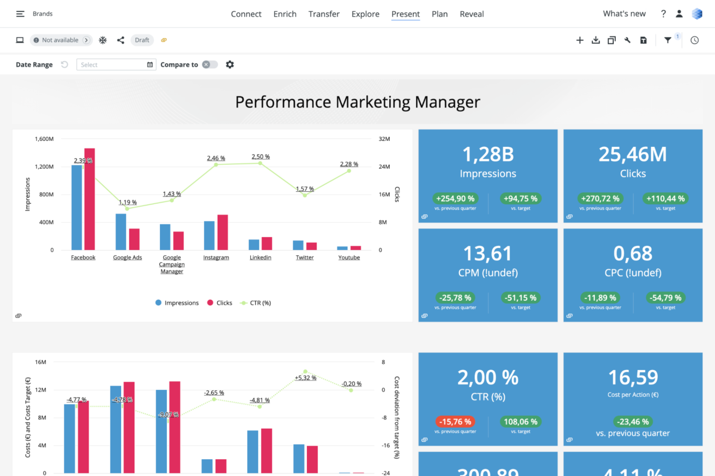
Adverity is an end-to-end marketing analytics solution that helps marketing teams improve their performance with data-based decision-making. The platform extracts data from multiple sources and consolidates it into clean reports, making it easy for marketing teams to identify growth opportunities.
This solution gives you the flexibility to choose between a no-code or a low-code approach to data manipulation, and you can leverage its automation features to standardize your data strategy across multiple projects.
The platform offers multiple templates for data interpretation, and you can tailor each template to your company’s needs.
Adverity costs from $2000/business. The company offers a free version with limited functionalities.
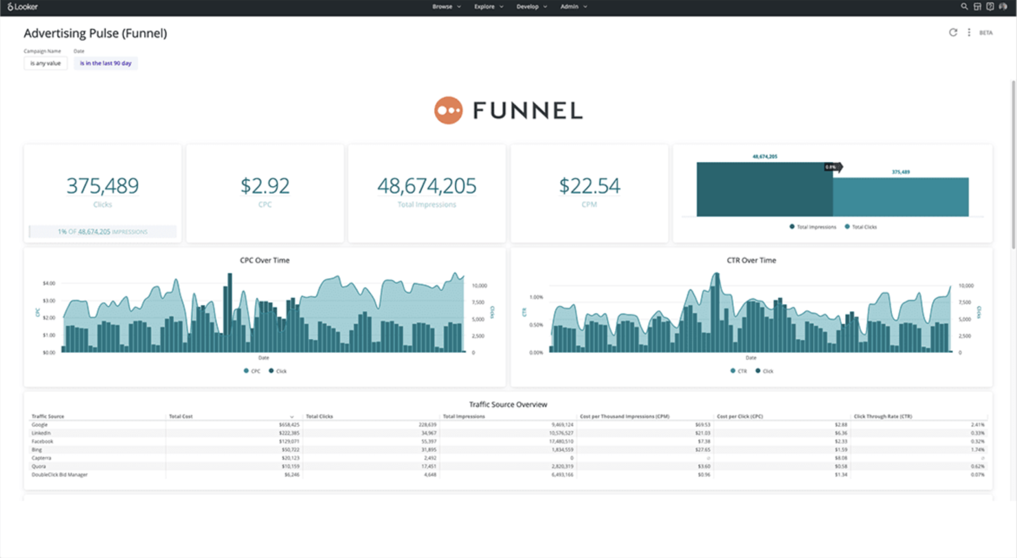
Funnel is a marketing data platform that enables you to track your marketing performance across multiple tools. The platform helps you extract metrics from multiple sources across dozens of marketing campaigns, and makes it easy to create comprehensive dashboards that track KPIs and calculate your return on advertising spend (ROAS).
This visual reporting solution pulls data from over 500 tools, including Google Analytics, Google Data Studio, Google Ad, Google Search Console, Moz Pro or any other SEO tool, and social media ad platforms, and combines it into a neat marketing report that shows you everything you need to know about your marketing campaigns.
Funnel has a vast learning center that helps you understand how to perform product analysis and turn the existing information into business intelligence reports. The solution has a bit of a learning curve, but once you get used to it, it can help you improve your marketing efforts.
Funnel costs from $399/5 users/month. You can book a free demo.

SAP Analytics Cloud is a platform that allows you to discover, visualize and leverage data for improved business intelligence (BI). This reporting tool impresses with its predictive analytics and analytics designer features, which allow you to create complex analytical applications.
One of the tool’s notable features is its ability to simulate any scenario and create plans from predictions. This helps you use more data in your decision-making process, making it easier to address your company’s needs. SAP Analytics Cloud comes with built-in templates you can use to organize data in real-time.
The platform’s dashboard suggestions are great, and they help you make sense of big data. SAP Analytics Cloud offers costs from $36/user/month. You can also request a 90-day free trial through their website.
Grow is one of the few no-code BI reporting tools that help you dive deep into data without SQL or software engineers. The platform pulls data from multiple sources, such as CRMs, spreadsheets, ad platforms, social media, and other tools, and helps you create easy-to-understand reports.
The highlight of this solution is that it allows you to see multiple dashboards in one place. This helps you make a visual comparison of various metrics, so you can improve your decision-making process.
Grow’s training library helps you understand how to manipulate data and combine multiple datasets to identify patterns. You can slice, filter, and use different visualizations to gain helpful insights for your business.
Grow offers custom pricing upon request. You can request a free trial.

Swydo is a data reporting and monitoring platform that helps marketing teams create professional-looking reports. The solution enables digital marketing experts to combine data extracted from multiple sources into a single report, helping them uncover insights about their campaigns.
One of the good things about this tool is that it comes with customizable widgets. This allows marketing teams to create templates they can use across multiple clients and reports.
The platform’s marketing dashboards look great and they make the information easy to understand, so marketers can use them to present their results to clients or decision-makers.
Swydo costs from $39/month. You can access a free 14-day trial.
Find inspiration for your reports from a community of five million data lovers
Observable is a cloud-based data visualization platform where your team can explore, analyze, and learn with data. Thanks to its versatility, this reporting tool is a great choice for developers, engineers, and generally anyone who enjoys coding their own way of interpreting data.
One of the great things about this platform is that it allows you to collaborate and communicate with data. You can start building reports and dashboards using predesigned templates and code snippets, but you can also reuse examples created by a community of over five million data enthusiasts.
Observable pulls data from the world’s most popular databases, including Google BigQuery, Snowflake, Excel, or Sheets. Users can export their visualizations to external reporting tools and apps, making it easy to present their findings to decision-makers.
Observable costs from $12/user/month. The platform offers a free 30-day trial. You can also access a free-forever version with limited capabilities.

dReveal is a white-labeled solution developers can use to improve their product without affecting customer experience. The software collects data and organizes it into customizable reports, so you can gain insights on how to make your product better.
dReveal has a modular construction. The Dashboard Designer gives you a bird’s eye view of what’s happening in your organization. The Report Designer helps you create and share reports. And the Model Designer helps you sort and group data sets in order to improve your dashboards.
One of the nice things about this platform is that it enables developers to define their own fields for reports, so you can break down large amounts of complex data and use it to create reports that are tailored to your company.
dReveal offers custom pricing upon demand. You can book a free demo.
monday.com
Keep track of product data and KPIs with colorful dashboards

monday is more than a reporting tool. It’s a visual open platform you can configure to improve your team’s productivity, build workflows, and keep track of KPIs and product data.
The platform impresses with its colorful interface, intuitive build, and automation features.monday’s reporting services make it easy to extract and interpret data. You can adapt the tool’s interactive dashboard to your needs, and take a deep dive into your company’s product analytics.
The platform’s advanced board filters help you narrow down on specific things in your boards, and you can use formulas, forms, graphs, or charts to simplify data. monday allows you to pull out information from multiple data sources, such as a Google Sheet, a Microsoft Excel doc, or other reporting software.
The platform enables you to slice and dice the available information in order to gain actionable insight into your company’s performance. monday costs from $8/user/month.
The company offers a 14-day free trial and a free-forever version with limited capabilities.
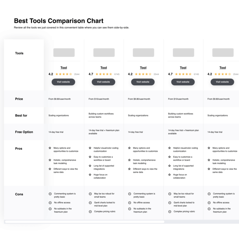
The Best Visual Reporting Tools and Software Comparison Chart
Here is a table where you can compare the tools we just covered in the overviews.
| Tools | Price | |
|---|---|---|
| Zoho Analytics | From $24/month | Website |
| Tableau | From $70/user/month | Website |
| Adverity | From $548/month | Website |
| Funnel | $399/month/account | Website |
| SAP Analytics Cloud | From $36/user/month | Website |
| Grow | Pricing Upon Request | Website |
| Swydo | From $39/month | Website |
| Observable | From $12/user/month | Website |
| dReveal | Pricing Upon Request | Website |
| monday.com | From $8/user/month (billed annually, min 3 seats) | Website |
Compare Software Specs Side by Side
Use our comparison chart to review and evaluate software specs side-by-side.
Compare SoftwareOther Visual Reporting Options
Here are more options that did not make it to the top, but are still worth your consideration.
- Smartsheet
Collaborate on reports in real-time
- Wrike
Best visual reporting to schedule report delivery to email accounts
- Toucan
Visual reporting tool that removes the complexity from data reporting.
- Sisense
AI-driven solution that enables you to uncover insights from datasets.
- Visplore
Data reporting solution that helps users break down and interpret big data.
- Analogyx BI
Real-time analytics tool helps users process and interpret data.
- Dundas
Data analysis software that helps organizations make data-driven decisions.


How I Picked The Best Visual Reporting Tools
I researched all the popular tools based on user ratings and reviews. Then I had to narrow down the list using my product management experience and based on the core features that make up a good visual reporting tool. Finally, I defined the criteria below to inform my evaluation of each option.
User Interface (UI)
I look for user-friendly tools that offer a nice interface and generate custom reports that are easy to interpret. Tools like SAP Crystal Reports are very powerful business data aggregators but not very intuitive to use. Therefore, these have to be tools that make it as easy as using Google Sheets.
Usability
Analytics platforms have the potential to be a mess because of their nature. They aggregate real-time data that comes through connectors and a range of data integrations. Therefore, I look for solutions that are easy to use and learn. This can range from self-service trainings, documentation, report templates, and any other learning resources for non-technical users.
Integrations
I look for tools that integrate with many (if not most) of the other software you use, such as open source software, ERPs, business intelligence software, and other performance management platforms. I cover which tools can be connected through pre-built integrations and which have to be through a third-party connector. I also mention if there are any APIs available to build custom integrations.
Pricing
I look for solutions that can turn raw data into actionable insights, so you can make smart decisions and increase your ROI. I cover free trial information and pricing per month on a monthly payment plan.
What are the key features of visual reporting tools?
- Easy-to-use reporting: Your team should be able to use the software’s reporting features with ease, splitting and segmenting the data according to their needs.
- Can handle multiple sources: A good data visualization tool should extract information from multiple data sources, such as spreadsheets, web pages, or other software, and turn it into neat reports.
- Adaptable dashboards: The tool should feature adaptable dashboards, so your staff can tailor them to each project.
- Communication and collaboration: The visual reporting software should allow your team members to examine the data, share information, and collaborate on reports.
What can visual reporting tools help you with?
Visual reporting tools help you uncover the story behind the data and make informed business decisions. And in today’s competitive business landscape, data is crucial to success.
As Tom Davenport, the President’s Distinguished Professor of Information Technology and Management at Babson College, said
Most people can’t understand the details of analytics, but they do want evidence of analysis and data. Stories that incorporate data and analytics are more convincing than those based on anecdotes or personal experience. Perhaps the most compelling stories of all are those that combine data and analytics, and a point of view or example that involves real people and organizations.
A visual reporting tool can help you identify weak spots in your product and create a step-by-step plan to improve them.
What's Next?
Speaking of reporting, feature flagging is a good way of reporting on products. It lets you accurately identify, test, and decide what to release next. I would also recommend you read about available product analytics certifications if you want to get more proficient at it.
Related Tool Lists:
If you want to stay up to date with the world of product management, sign up for our free newsletter and receive the latest tips from top thinkers in the industry directly in your inbox.