I’ve Used Every Wireframing Process And This One Is By Far The Best
I’m confident that you have heard about the benefits of wireframing from either your product management courses or from colleagues or peers. I’m also assuming that you have tried introducing some form of a wireframing process in your product, too.
But, is your process working well? Are you able to get the most out of your wireframes with the way you do them now? Well, it really depends on the process you are using.
To help you increase the effectiveness of your wireframing, let me share my experience and tell you about a wireframing process that I have found to be the best one out there.
Wireframing Is An Essential Part Of The UX Design Process
Wireframes are high-level visual representations of your product that you can use to illustrate how you want the product to look and work. With these visuals, you are able to test and iterate on your idea before asking your engineers to jump in and start the development process - saving you time and money.
I really like the definition of wireframing by the user experience gurus at NN/g as it showcases the key benefit that you are getting from it.
Quick and cost-effective technique for identifying major usability issues early with sketches and paper. Perfect fit for Agile and Lean processes.
No matter which method of wireframing you choose (drawing on paper is perfectly fine!) or which wireframing tool you decide to use (for that, check out our list of best wireframing tools), I would recommend you follow this process that I have found after trying pretty much every wireframing process there is.
Step #1: Make Sure That You Know Your Users Well Enough
Great design starts with a team that knows its users well. After all, who needs your design and the product it visualizes if it is not able to properly serve the needs of the people it is intended for? Therefore, the most important step you should take before starting your wireframing is user research.
In reality, user research should continue throughout the entire lifecycle of your wireframing process (and after that as well), but let’s focus on the beginning phase when you are trying to understand the needs and the day-to-day reality of your future customers.
Here are some of the important activities I recommend you do during this phase:
Exploratory Interviews: Want to know what your users want? Well, how about asking them directly? You can begin by making a list of questions that will help your users talk about the problems they are experiencing and the solutions that they are using to solve these problems.
Then, you can reach out and recruit potential users via social media, specialized platforms like Userinterviews or Respondent, or even meet them at trade shows.
Finally, you conduct the interview with either a recorder (so you can analyze it later on) or an interview buddy sitting beside you and taking notes.
Note: Ideally, you will do both.
Surveys: While interviews are a great source of qualitative data that help uncover the reasons behind user needs and behavior, surveys get you a mix of qualitative and quantitative data, allowing you to validate findings with statistical significance.
I will not go too much into detail here, as we have an entire guide on survey questions that you can check out.
Field Studies: In this case, you observe your users in their “natural habitat.” It means that you are either virtually or physically present in the environment where your target users are experiencing the problems you want to solve.
For instance, say you're building a tool that will make it easy to edit social media videos. Your field study would be to observe the process of a social media influencer shooting a TikTok video, editing it, and uploading it to their channel.
Although field studies are relatively hard to arrange (not all the users will be comfortable with you observing their daily activities), they provide you with the richest context and learnings about your users.
Discovery Workshops with Stakeholders: Yes, great user experience design is built around the needs of the users, but let’s not forget about your key stakeholders, either. Although your users are stakeholders too, I will use this term to represent your founders/C-suite, your investors, any legal or regulatory body that you need to work with, etc.
Sometimes you make design decisions not based on your user needs, but taking into consideration:
- Your vision and strategy: Apple’s users love wires and wired connections, but the vision of Apple is wireless—that’s why they keep removing ports. (Now you know!)
- Your legal environment: Having a huge cookie options selection is not the most user-friendly interface, but it is something that you might be legally obligated to show.

There is also a case for intuition—despite knowing your users well, you might consult your own intuition to make some form of a design choice.
With the concept and types of research clear, let’s illustrate what it will look like in real life with an example.

Example 1: Creating a Wireframing Tool for a UI Professional
Imagine you are in charge of creating a wireframing tool (something similar to Balsamiq) and you want to know how exactly your target users (in this case, design teams) will use it and which problems they hope to solve.
To find this out, we can devise a questionnaire that we want to ask our users during an interview. Here is what we can include:

Now, let’s imagine that we find out that the feedback is mostly in the form of a comment on a specific part of the wireframe, and the product manager has to sign off on the wireframe design. These are two findings that will directly affect our design as we need to design a workflow and user interface for commenting on the wireframe and approving it.
To sum up, running discovery research is the most important part of your wireframing process and I would not recommend you skip it. Now, with all the learnings in your hand, let’s move on to the next step in our wireframing process.
Step #2: Build Your User Flows
Before creating the screens/pages themselves and placing your components like forms, cards, images, buttons, etc. on them, you need to understand the sequence of steps that you imagine your users will take.
These sequences are also known as user flows and they represent all the possible pathways that your users can take to reach their goals. These goals can either be something ordinary and “administrative” like signing up or changing their password or represent your core features (like searching for and streaming music for Spotify).
Either way, building user flows is important as it will help you better visualize all of the screens/pages that you want to design, as well as the content that you need in each.
To understand the flows better, let me show you one using a flow chart tool Flowmapp.
Example 2: Visualizing a User Flow of a Web Design Tool Using Flowmapp
Let’s assume that you are building a drag-and-drop web design tool like Webflow. Your users are no-code web designers and you want to visualize the steps they will be taking to add a background image to their web page.
Here is what a user flow for that feature will look like on Flowmapp:
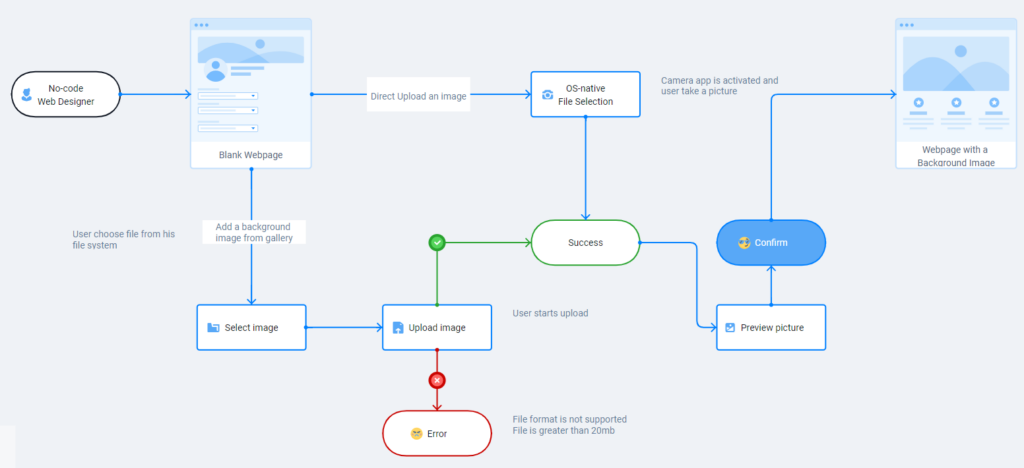
As we can see, the emphasis in a user flow is more on the actions that the user is taking and the sequence/causality between them, rather than the pages and their design.
In this example, we want the user to be able to select an image from the gallery or upload/add one to the gallery. We also want the user to preview the image before our tool will apply it as the background of our user’s webpage.
By looking at the flow here, we understand that the user will stay on the same page—the webpage editor, and maybe see another screen showing the image gallery in the form of a popup.
Therefore, there is a page and a popup to design with relevant design elements and features.
As we have an overview of the steps that users take to accomplish their goals in our product, we can finally start the actual wireframing itself.
Step #3: Start With A Low-Fidelity Wireframe
Yes, making a wireframe is the third step in this wireframing process. However, believe me, doing the previous two will take the quality of your wireframe to a whole new level and it is definitely worth spending time on them.
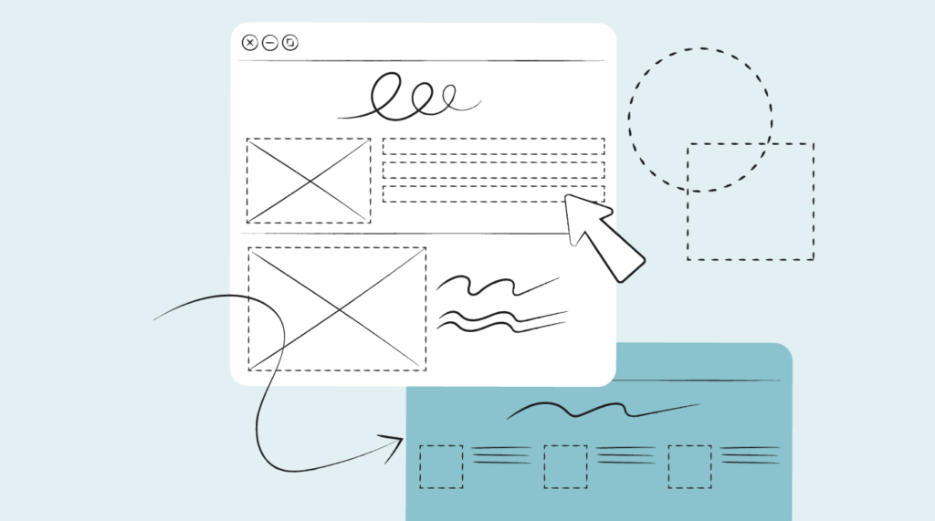
Regarding the wireframe itself, I recommend you start with a low-fidelity one. A low-fidelity wireframe will not include any specific details like the correct colors/sizes and other design attributes of your pages and screens. It will not have real images and text either. Instead, you will have placeholders for both.
And there is a good reason why a low-fidelity wireframe is this way and why you should start with it—lo-fi wireframes are quick to build and edit.
The chances are high that you might have missed something quite important in your design. When gathering feedback on it (we’ll talk about it in detail in the next step), you might understand that there are a lot of items/flows that need to change.
If you had a complete design, making these changes would have taken you days. But, with a lo-fi wireframe, you can make your edits and take your design for another round of feedback within a couple of hours or less.
So, after praising lo-fi wireframes this much, let’s look at what they look like using a popular wireframing tool—Balsamiq.
Example 3: Creating a Website Wireframe
The beauty of design tools that are specialized in wireframing, especially low-fidelity, is that you don’t have to draw each element from scratch.
Instead, they usually come with a variety of pre-made basic interface elements (e.g. images, menus, breadcrumbs, buttons, etc.) along with drag-and-drop controls to make designing especially quick for you. Here’s an example I have built using Balsamiq.
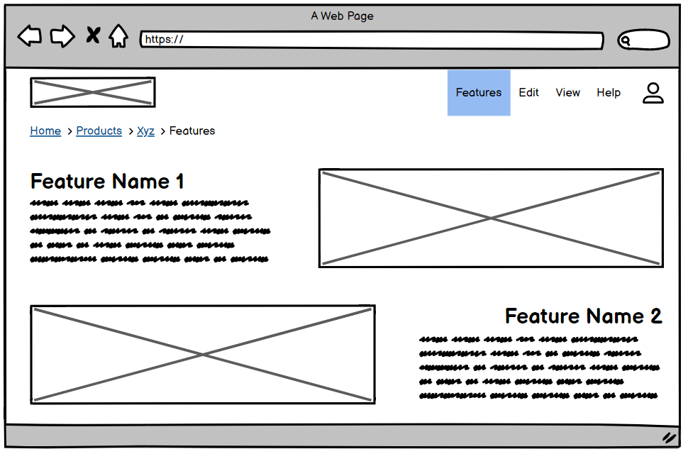
Considering the very nature of low-fidelity wireframes, they are usually grayscale or have minimal color and visual design added to them. Instead, all you can see is the general looks of UI elements in your design as well as their placement and information architecture.
Now, if you have your low-fidelity wireframe ready, it is time to take it for your first round of review.
Step #4: Iterate On Your Low-Fidelity Design Internally
Before investing time and effort in building your final product design, let’s make an educated guess that there are many things we have done wrong or forgotten to consider in the design and start showing our lo-fi wireframe to our colleagues and stakeholders.
Sure, you could show this design to your users, too. But, considering how hard it is to recruit users who would be willing to review or usability-test your design, I would recommend you use their precious time on checking out more high-fidelity designs and not waste their time on pointing out issues that your colleagues could have easily found.
I do recommend, however, involving your stakeholders in this phase. Two of the key reasons for this are:
- Shrinking the “distance” between them and the team members that build the product by involving them from the early stages.
- Fixing design issues related to strategic alignment in early phases to save your time later on.
Finally, as soon as you have gathered feedback from your colleagues and stakeholders, you can fix your lo-fi wireframe based on it, validate the fixes with them, and move on to making the actual visual design for your product.
Step #5: Prepare a High-Fidelity Wireframe and a Clickable Prototype
As you have a proper understanding of what your design will look like on the high level, you are now safe to invest in creating the visual parts of your design and bringing it to the state when it looks the most like what you intend to build.
At this design phase, your digital wireframe will include:
- Your UI design: including the right colors, shadows, typography and fonts, margins, etc.
- Your visual content: if you intend to have any images, illustrations, videos, or other graphical elements on your pages, this is when you add them.
- Your page’s copy: we refer to the text on your UI elements, buttons, your headers, etc.
- A mock of your content: if your design includes any user-generated content or content of your own, you should add a mock version of it too. (For example, the design of a comment under a post that has the typical size and content of a comment that your real users would make.)
Apart from being the main deliverable for your engineering team who will build your product based on its design, the high-fidelity wireframe can also serve as a great tool for usability testing with your actual users.
You can either use the hi-fi wireframe itself for the test or take it to another level by adding interaction design to it and transforming it into a clickable prototype.
It is really easy to confuse the terms I talked about here (hi-fi wireframes, interactive prototypes, etc.). So, let me clear them up for you as well as show a couple of examples.
Differentiating Types of Wireframes: Mockups vs Hi-Fi Wireframes vs Clickable Prototypes
These three concepts are quite similar to each other, and, unfortunately, people use them interchangeably—creating confusion among those who are relatively new to product and design.
Here’s what each term means:
High-fidelity wireframe: We already touched upon this one above. So instead, let me show you what it looks like.
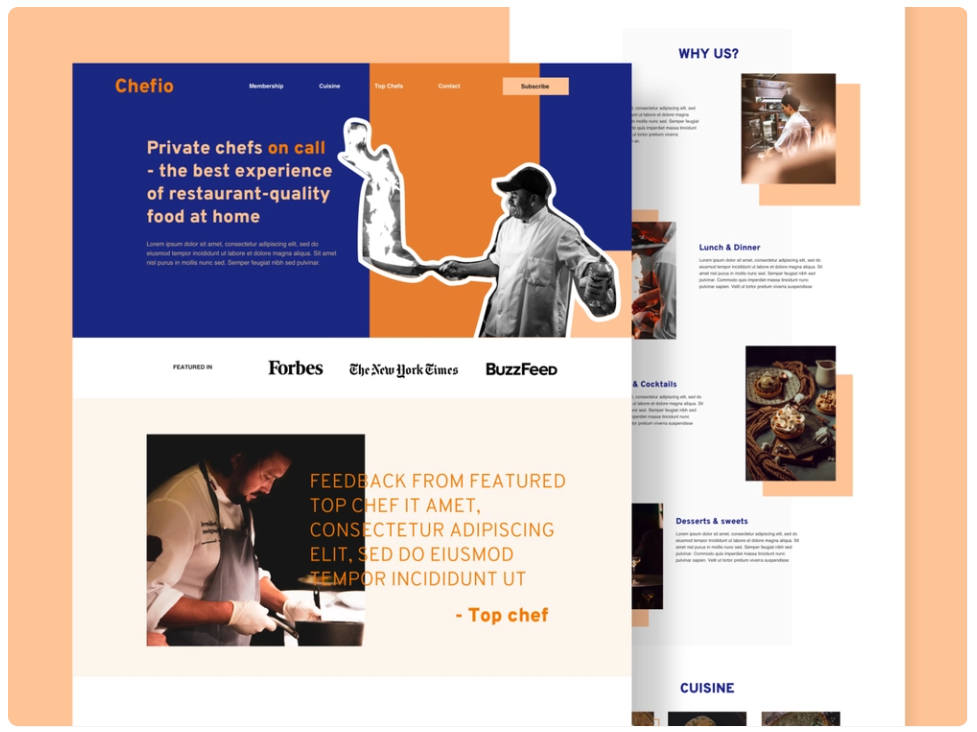
This compelling design is for a service that lets you hire private chefs to cook high-end dishes for you. As we can see, this design includes everything—from final images to colors and positions. There is also a bit of “lorem ipsum” text on it to represent the testimonial of a pro chef on the page.
Mockup: Unlike its counterpart, the mockup does not only include the final design, but it also shows the environment where that design appears. For instance, if you are designing a letterhead, a mockup would show a piece of paper on a table with your design on it.

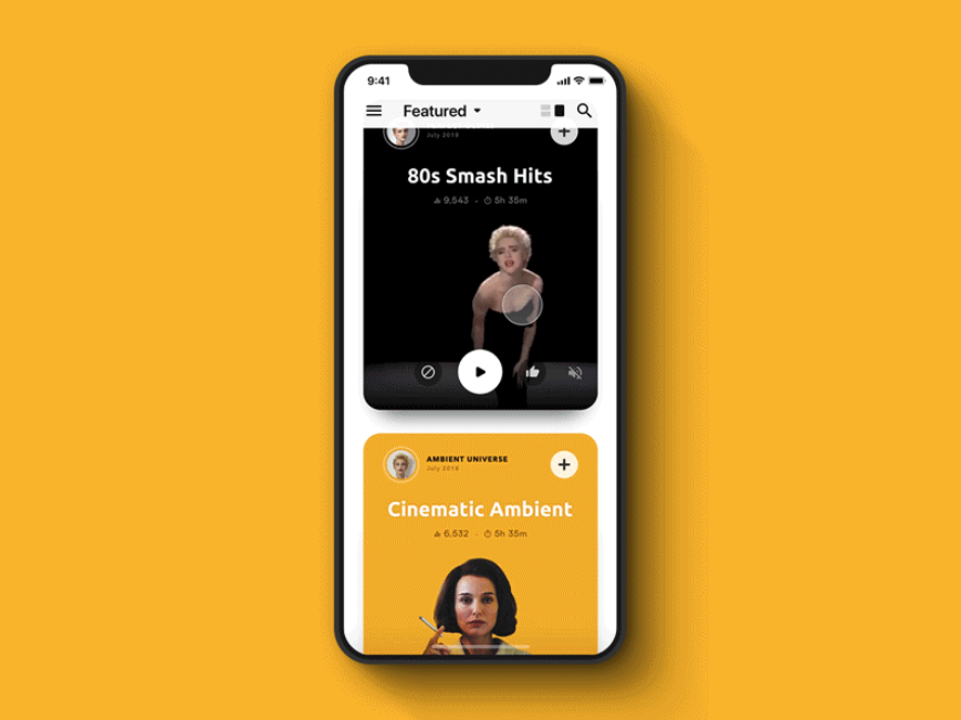
In the case of a mobile app, your mockup will show the silhouette of an iPhone or an Android device with your design appearing on the screen.
Prototype: The prototype looks like a hi-fi wireframe, but, apart from the final looks, it will also try to mock the functionality of the product.
With a clickable prototype, you can add basic interactivity like scrolling, animations, clicking on buttons, navigating inside the app, etc.
By mocking the interactivity of your product, prototypes let you test out the way you want your features to work before you develop them.
Moreover, you can do user testing by giving your high-fidelity prototypes to your users and watching how they interact with your product, solve their issues, or try to find their way through your design.
Wireframing Is A Game Of Testing And Iteration
The iterative nature of wireframes lets you save tons of effort on fixing your mistakes. Moreover, by going through a wireframing process like this, you are making sure that your users are getting a product that will serve their needs the best.
Do you use a different wireframing process in your company? I am curious to hear, so leave a comment below and tell us how you do it!
I hope that you liked this guide and found it useful. Be sure to check out other guides on product management written by some of the best professionals in the sphere, such as:
- The difference between Product Vision and Strategy by Kerstin Exner.
- The 3Ps of Product by Benoit des Ligneris.
- Product Requirement Documents by Sarah Tolle.
Finally, you can subscribe to our newsletter, and we will send compelling content to your inbox too.