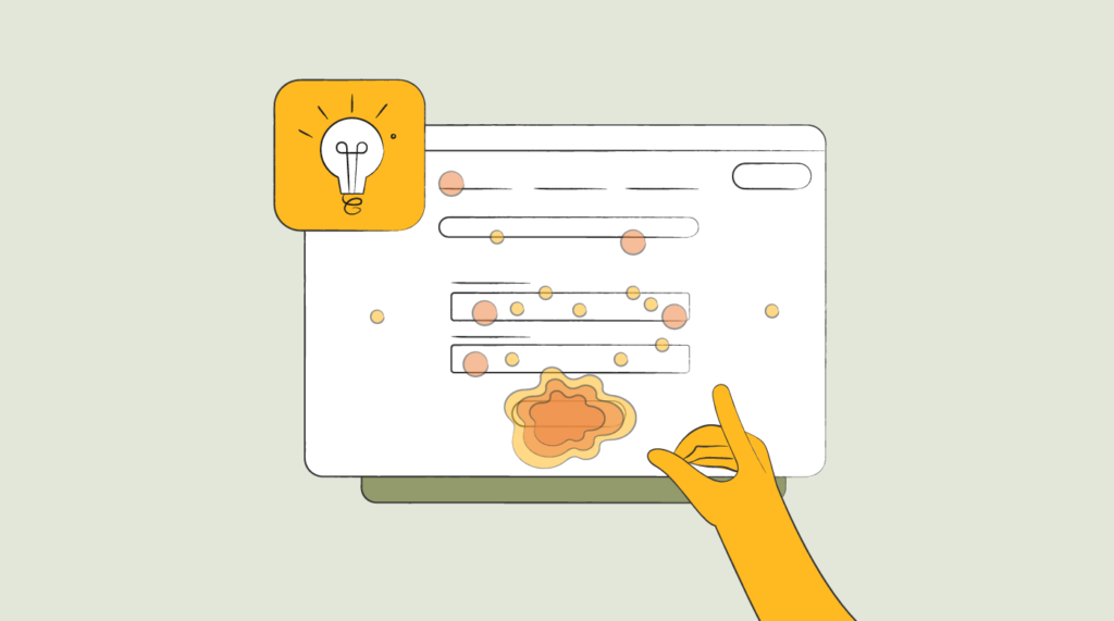
How To Use Heatmap Analytics To Fire Up User Retention
Becoming a data-driven product manager is among the best things that you can do to level up your product game.
As part of that effort, you might have already started working with various analytics tools and even tried to base your decisions on their data. If you have landed on this article, then I am assuming that you're interested in analyzing your user interface using heatmaps, too.
If so, you have come to the right place. Let's do a deep dive into this hot tool!
What Are Heatmap Analytics (and How Do Heatmaps Work?)
Heatmap analytics is a methodology of measuring, visualizing, and analyzing your users’ behavior using—you guessed it!—heatmaps.
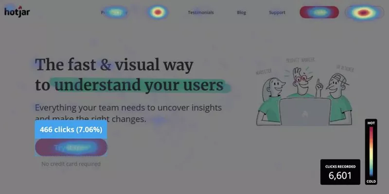
Heatmaps are screenshots of your user interface highlighted with different color overlays based on how your users interact with the page's various areas. The colors used for highlighting usually range from red (lots of user interaction) to blue (little user interaction).

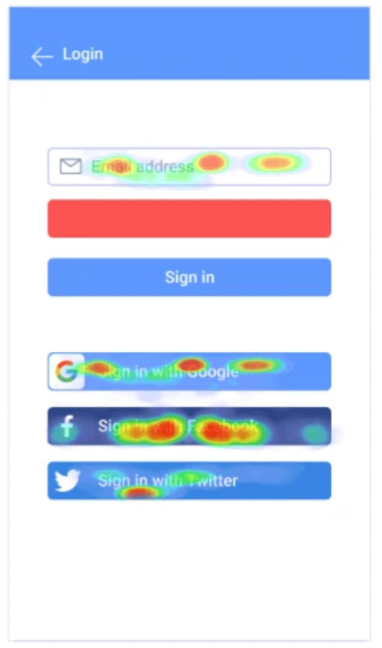
The particular heatmap above is an example of a "click map," which tracks and visualizes users' click hotspots.
As we can see, the Login and Create Account buttons get a lot of clicks here, but the navigation menu at the top gets little to no attention from users.
Heatmaps are fantastic visualization tools for analyzing your product and user experience. They come with a variety of benefits, but there are downsides to using them, too. Let’s move on and learn a bit more about both sides of this tool.
What Are the Benefits of Using Heatmap Tools?
Heatmap software is becoming increasingly popular. They used to belong to the realm of digital marketers during the past decade—until product teams caught on to their usefulness for dialing in user experience. Today, they've become an indispensable tool for PMs and UX designers.
And there is a good reason why heatmap tools have become so popular—they are just so good at conveying your users’ behavioral data. If you haven't already incorporated one into your product stack, integrating a heatmap tool is a must—and here are a couple of heatmap benefits that I'm hoping will sell your product team on adopting the tool.
Heatmaps are Great At Complex Data Visualization
Can you imagine what a user click data would look like in a non-visual format? Probably something like this:
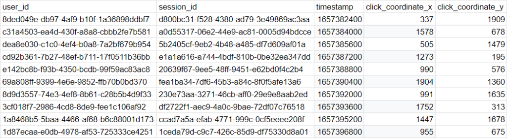
Ow, my eyes!
Now, try to make sense of the user behavior based on these data points. Can you tell me which buttons the users like to click on the most? Probably not.
Now, let's try a visual representation of the same data.
It’s much easier to determine which buttons are performing better by looking at this visual, isn't it?
The beauty of heatmaps is in their ability to convey complex information in a very easy-to-digest way.

Heatmaps Help You Identify User Intent
Modern web analytics tools (e.g., Google Analytics or Amplitude) are great at tracking and visualizing your website visitor behavior and demographic data (I keep mentioning the web, but heatmaps are equally useful for mobile devices and mobile apps, too). But their main problem is that the data they gather is too “quantitative” and lacks the “qualitative” perspective as to why users behave a certain way.
If 2,000 users sign up for your product each day, but only 100 download and install your app, you might confidently say there is something wrong with your activation. But you will not be able to pinpoint the exact problem, or why people are failing to install your app.
If you used a heatmap tool, however, you could review your rage-click map and see that your download button is not working for certain browsers, and people are getting mad and rage-clicking on it.
This is another one of heatmaps' best features—they can enhance your quantitative data with qualitative insights.
Heatmaps are Cost-Efficient Alternatives to Usability Testing
Let me put this straight. Heatmaps cannot and should not replace usability testing. Testing for usability is super valuable for your product and design efforts, and you should never consider ditching it.
Heatmaps will, however, save your time and effort in doing usability testing on basic page elements and user journeys. For instance, if you are testing something as simple as a sign-in page, you don’t really need to organize a usability testing session.
All your users do on a login page is fill in their credentials and click on one of the login CTA buttons available on the page. By looking at heatmap data, you can easily see how users interact with your email/password fields and buttons. Doing usability testing and reviewing the session recording for something like this would be wasteful.
What are the Limitations of Website Heatmaps?
Heatmaps look like fantastic tools for visualizing user behavior and intent cost-efficiently. But just like any other tool out there, they are not flawless and come with a couple of limitations that you need to consider when using a heatmapping tool.
Here's where heatmaps fall a little short:
Qualitative Insights Are Limited In Heatmaps
I mentioned the presence of qualitative insights as a major benefit of heatmaps. But, I need to be fair and mention that these insights are limited.
Yes, you can easily spot rage clicks on a page, and you can use the movement map to see how your users’ cursors are moving across your interface. Yes, this data will help you understand your users' high-level intent and feelings.
You cannot, however, get anything more than the mentioned “high-level intent” with heatmaps.
For instance, when reviewing a heatmap of your login page, you might see that the majority of users are signing up by manually filling in the email address field, and very few of them use the “Login with Google” option.
Your heatmap will not be able to tell you the reason behind this behavior. To dig deeper into something like this, you'll need to conduct user interviews, run surveys, or find some other way to gather meaningful user feedback.
In this particular case, for instance, you might talk to a handful of your users and find out that your users are mainly in enterprise space, and most of them use Outlook email instead of Google's G-Suite. As you don’t have a “Login with Microsoft” option, these users tend to add their email addresses manually instead.
Too Much Emphasis On Basic Types of Engagement
Another downside of heatmaps is that they only track your scroll, cursor movement, and click behavior. It means that, if you solely rely on your heatmaps to analyze your users’ behavior, you might get misleading information just because good-looking heatmap data (e.g. lots of clicks) does not always mean "good" engagement.
Let me say that again.
Good-looking heatmap data does not always mean good engagement.
Imagine looking at a heatmap of Google Docs’ document editor page and seeing that many people click on the share button. Thrilled, you (naively) conclude that your sharing functionality is performing well.
But suppose you check your other website analytics tools only to discover that, although users click on the share button to open the Sharing Popup, very few of them actually share their documents with someone else. The majority of users simply close the sharing popup right after opening it.
Privacy Concerns
Heatmap tools are notorious for actively tracking and storing sensitive user data. There is no way around it; you will have to keep track of your user’s mouse movement and clicks to be able to produce a heatmap.
So, when you’re integrating a heatmapping solution (especially if it has real-time analytics, session replay, and page views), you will need to keep this in mind and have the necessary confidence that your users will not be pissed at you for tracking their browsing behaviour.
Another thing that you need to keep in mind is your legal compliance. You will need to work closely with your legal and security teams to produce the right legal documents and ensure that your tracking tactics don't violate anybody’s rights or create legal risks for your company.
This is especially important if you claim to comply with major privacy regulations like GDPR, CalOPPA, etc.
That's the gist of doing analytics with heatmaps, along with their advantages and downsides. Let’s move on and discover how you can use this tool to analyze your customers’ behavior and extract some valuable conclusions.
3 Real-Life Use Cases Of Heatmap Analysis
Based on my experience, heatmaps have proven to be highly valuable tools for understanding what’s going on with your product.
Taking into consideration the benefits and limitations of this tool, I almost never look at heatmap data in isolation. Instead, my team and I usually combine it with the data from other analytics tools to get a more comprehensive overview of our product and users.
To help you with practical applications of heatmapping, let me share a couple of real-life use cases with you.
1. Decoding Rage Clicks: A/B Testing With Fullstory Rage-Click Maps and Google Optimize
Let me start with an analysis use case that involves my favorite type of heatmaps—rage click maps.
You can consider a user’s click on your UI a "rage click" if they do multiple clicks on the same element continuously. It's broadly assumed that this type of behavior indicates user frustration and rage (hence the name).
There are many reasons you might end up with rage-clicking users. Most frequently, they're triggered by:
- An element that looks clickable but is not. Your user clicks on it, thinks it’s not working, and gets mad.
- Your buttons are simply not working. Self-explanatory.
- The buttons are working, but a design issue makes one or more of the buttons hard to target.
With the help of rage click maps, you can identify the elements on your UI where you get rage clicks, try to understand the reason behind them, and fix the problem. Here’s what it looks like for an e-commerce site selling fruits and veggies.
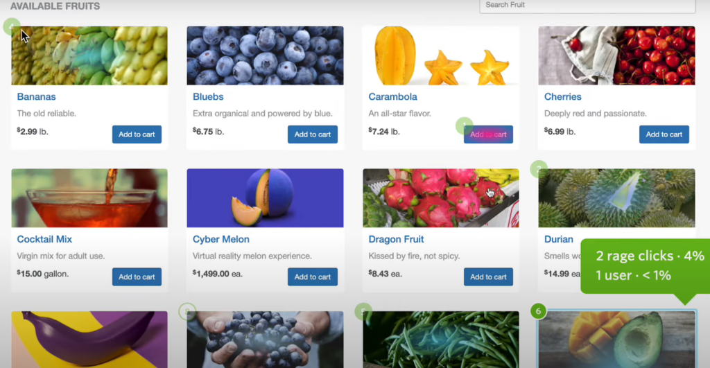
The problem with finding problematic areas and fixing them is that your fix might not work, and people might still continue rage-clicking. To solve this, you can use any A/B testing tool (e.g. Google Optimize) to test the effectiveness of your fix.
Here's How: Create an A/B test where variant A is your fix and variant B is your original state. After turning the A/B test on, you start looking at the rage click maps of both variants and calculating the number of rage clicks each one gets.
If your variant A has gotten fewer clicks, then your fix has worked, and you can confidently deploy it.
2. Demystifying Conversion Rates: Conversion Rate Optimization With Hotjar Move Maps and Google Analytics
The next instance we'll look at is probably the single most popular use case for heatmaps—analyzing conversion (or other similar metrics).
As I mentioned, a combination of data from heatmaps and analytics tools will give you the best results in terms of getting accurate data and avoiding misleading findings. In this particular example, we will see how you can use a combination of Google Analytics and Hotjar Move maps.
Imagine you are in charge of an e-commerce store that offers two shipping options for delivering purchases to customers. The pricing for these two options is $2 for "Standard" (aka "slow") shipping and $10 for "Express" shipping.
Your goal, in this hypothetical example, is to analyze the conversion rate of the cheap and expensive shipping options.
Here's How: Start by looking at your conversion rate in Google Analytics for your expensive option. Let’s assume that the rate is 5% (or, only 1 in 20 users picks the more expensive option). This is really bad news for you, so now you need to understand the reason behind such a low rate.
To do that, you'll want to open the move map of your checkout page (where the user picks shipping options). Imagine that the move map shows that users hover their cursor over the expensive shipping option, click on the text that says 'Express Shipping' (instead of the 'Select' button just below it), give up, and just move forward with the cheaper one (which is selected by default).
This behavior shows us a few possible hypotheses:
- Your users actually want to read more about the expensive option before choosing it, as they don’t really understand the extra value/benefit they are getting from it.
- The 'Select' button is not adequately visible—perhaps it's hidden under the fold for the majority of users.
We can then do 1-2 quick interviews with users and check if our hypotheses are correct, or if the issue is something else entirely.
3. Race to the Bottom: FAQ Section Performance Optimization With Scroll Maps
FAQ sections are highly underrated tools in the world of product management.
FAQs are fantastic tools for product managers. One of the great use cases for adding an FAQ section into your product or website is to convert prospects who are ready to buy your product but need to get answers to a couple of questions that worry them first before making the purchase.
Considering the value you get from your FAQ section, it's pretty important for you to track its performance and optimize it.
Here's How: Normally, we'd place the FAQs at the bottom of a web page—but there's a significant chance that your users will not scroll that far and will miss the section. To measure this, you can use scroll heatmaps, which show the amount of time users have spent on each section of the page and how far down the page they've scrolled.
Here’s what it looks like:
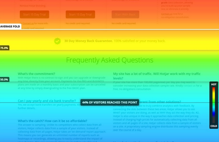
In this particular example, we can see that the majority of users have seen the top part of the page (it’s red), but only 44% have scrolled enough to see the FAQ section (it’s blue with a percentage marker on it).
Honestly, 44% is a good result. However, if you think that more people should view your FAQ, I'd suggest looking for a UX solution that enables them to "jump" directly to the FAQ section.
Visualized data is great, but pairing it with your product intuition is better.
Heatmaps, along with other analytics tools, will significantly improve the quality of decisions you are making—that's what makes you a data-driven PM!
But if I can leave you with one piece of advice, it's this:
Don't solely rely on analytics data—listen to your heart, too.
As product managers, we have this superpower called product intuition that helps us make smart decisions, even with limited analytics data on hand. So, if you pair your intuition with the learnings you get from your heatmaps, you can take your decision-making skills to a whole new level.
Another superpower that product managers have is the constant hunger to learn something new—and we can help with that! Sign up for our newsletter to receive a biweekly batch of product management insights, resources, and other goodies straight to your inbox.