7 Deadly Sins Of Product Design (And How To Avoid Them)
At this point in our timeline, there is absolutely no excuse for poor product design. In the ever-competitive world of software products, getting your UI and UX design right is non-negotiable. Even if you have great technology that is able to solve the pain points of your users, poor UX will send users running from your product—either because they couldn't figure out how to use it, or frankly, because they hate it.
Brace yourself; I'm about to deliver some "tough love" on how not to do UX by listing the seven deadly sins of product design and exposing some of the worst offenders.
Sin #1: “The Christmas Tree”
One of my most pleasant childhood memories of mine is when my sister and I were decorating the Christmas tree. As soon as we were done, we would look at it in awe as it was something absolutely gorgeous to us. Well, at least that’s how we saw it. What did it look like in real life? Something like this.

I assume you know where I'm going with this. Unlike the Christmas tree that you really want your kids to decorate however their heart desires, your UI and UX should not look like a huge mess of elements and colors scattered all over the place.
Now, let’s look at a real-life product that looks like a “Christmas tree”.
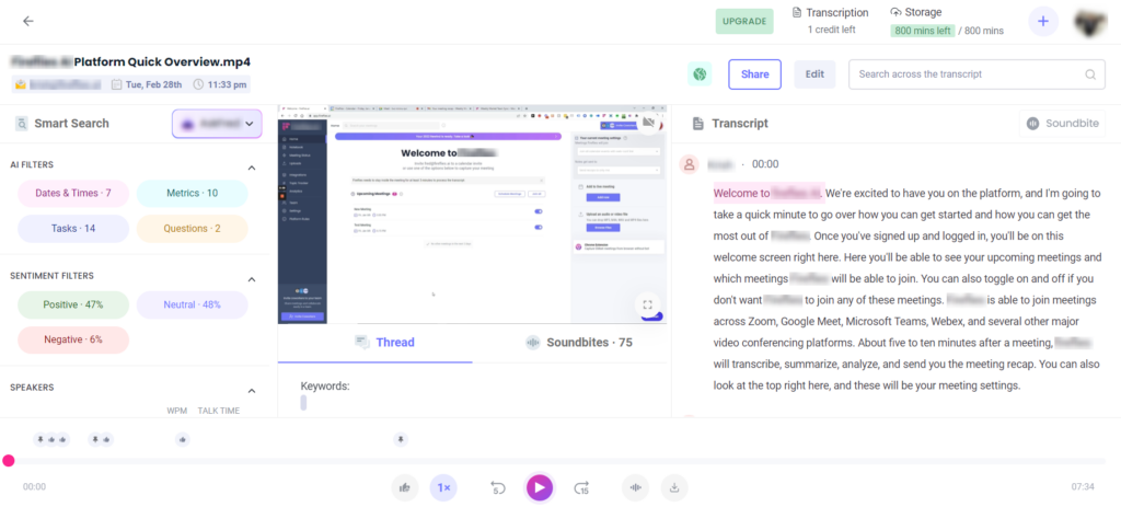
Just look at this for a moment and try to explain to me what this product is about. I’m sure you got lost in the UI and could not figure it out for a while either. There are just too many things happening on this screen, it's basically impossible to comprehend where you are and what you should be doing.
The issues I see with this interface include:
- Overuse of color: Color is a powerful tool in the hands of crafty product designers, as they can lead users in the right direction. However, if you have too much color in your UI, it weakens this power and every colored element starts to compete for attention.
- Overload of CTAs: What’s the most important thing that I should be clicking on now? Honestly, I have no idea—there are buttons all over the place.
- Confusing Layout: So, basically, the screen is divided into three columns, where the center one has two tabs and there is also a large timeline section at the bottom. The designers have tried to squeeze in as many things as they could into a single screen.
Do This Instead
This is a case of trying to approach UX by creating some sort of order out of a ton of information. Instead, think of your UX as a map for the behavior you want from your users. It's product design 101 that color, CTAs, and layout should work together to direct your user to take the right next steps.
Sin #2: Bad Visual Hierarchy
Visual hierarchy refers to the arrangement of elements on your UI in a way that clearly conveys the hierarchical relationship between them.
The article you are reading now, for instance, has a clear visual hierarchy as the title is in large type at the top, the subheadings are in smaller type than the title but much bolder than the paragraphs, and so forth.
In both cases, we highlight the titles by either making them larger or bolder—clearly indicating that the paragraphs are about the topics stated in each corresponding subheading.
Visual hierarchy is a great way to organize your UI and make it easy to navigate. The absence of it, however, is a great way to make your users struggle to find their way through your interface.
One of the prominent failures of visual hierarchy that annoys me on a daily basis is the answers section of Quora.
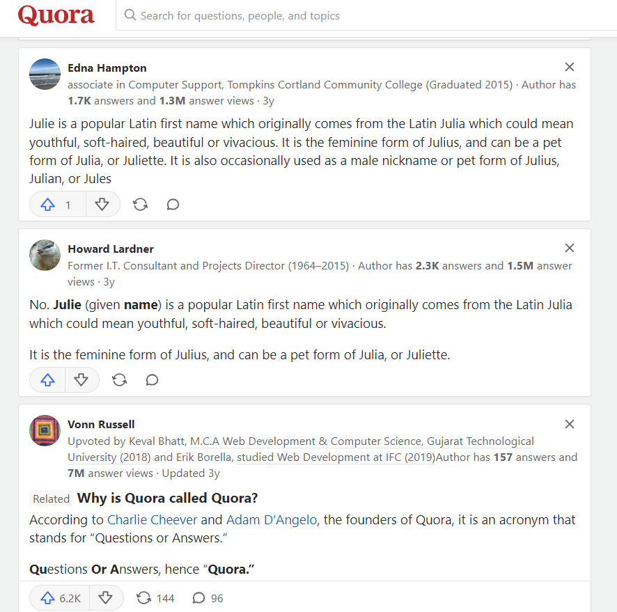
In order to encourage people to browse other questions and stay on their website longer, Quora has also included questions and answers that are related to the question that you are currently browsing.
I don’t mind it. It’s an existing user behavior and Quora has found an organic way to benefit from it.
I do mind, however, the way they have designed these related questions/answers. They look nearly identical to the real answers on the page and lack a visual hierarchy. Look at the screenshot above and tell me which one is an answer and which is a related question. You really have to read slowly to catch it.

Do This Instead
Ideally, the related questions would be less prominent on the UI and be lower than the main answers in terms of their visual hierarchy (e.g. have a grayish background instead of a white one).
Sin #3: UI Straight Out Of The 2000s
I know, I know, Craigslist has a horribly-outdated UI and it still operates perfectly fine. But it’s an exception to the rule and you should not think that it is still just dandy to have something like that in 2023.
The problem is that, unlike Craigslist, your product will not be super popular and does not have a universally-recognized brand. Therefore, if people saw something outdated when visiting your website or using your application - they will simply not take you seriously. However, you always have the chance to get recognized by your creative logo design and branding.
Sadly, sometimes it is the most “serious” organizations that are guilty of committing this sin.
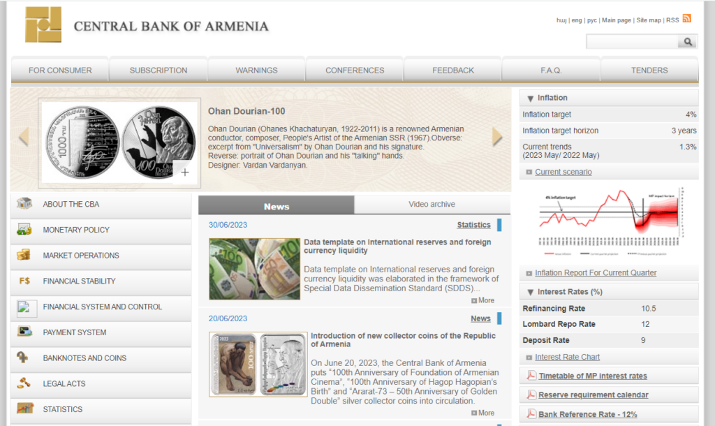
I had a chance to collaborate with the Central Bank of Armenia a couple of years ago. They have some of the most talented financial analysts and monetary policy experts out there. Moreover, the president of this institution (a Harvard Graduate) used to be my professor and he is arguably the smartest person I have met in my life.
The website of the Central Bank, however, looks so bad that it will be hard for you to believe that this is a highly prominent organization with super-talented staff.
Sin #4: Dark Patterns (Or Using UX Against Your Users)
In the world of UX, "dark patterns" are user journeys and UI elements that misinform the user and lead them into performing an action that they are not aware of.
There is a certain e-commerce shop with an orange arrow-shaped logo that is especially “famous” for implementing dark patterns. They're guilty of this to the point that there are ongoing complaints and investigations against them for not following FCC rules.
One of the most famous user experiences that falls under this category is the way you're supposed to cancel a Prime Membership.
To be fair, I think it is still a good idea to ask your users for feedback when they cancel their paid subscription or even to offer them a “please don’t go” discount. But you need to respect the time and the patience of your users.
Please take into consideration that the people who want to cancel your subscription are most likely annoyed or unhappy with you. So, making it difficult for them to cancel will make them even more angry (and you can forget about the prospect of bringing them back someday in the future).
If you try to cancel your Prime Membership, for instance, Amazon will ask you to reconsider.
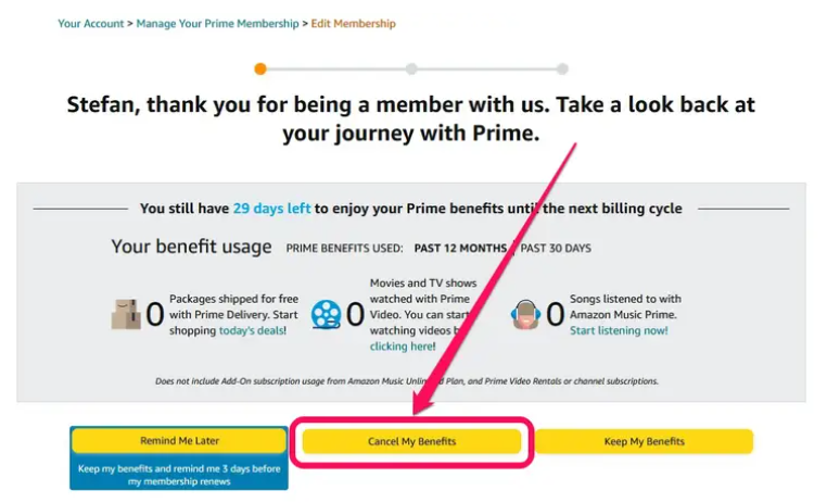
I’m ok with this screen, everybody does it.
However, I am not ok with the fact that you will need to confirm your selection two(!) more times in order to cancel (you’re kidding me, right?). Moreover, the wording and colors that they use for their CTAs are tailored to make it hard for you to find the one that will cancel the membership instead of keeping it.
Do This Instead
Don't try to fool your users into action that is contrary to their intent, or try to "wear them down" by making it excessively hard to cancel. People are smart enough to know that you're doing it on purpose, and it will just make your competitors look more attractive. Instead, take a brief survey on the reason they're leaving you and make the process efficient while leaving the door open to return.
Sin #5: Not Following Form Best Practices
Forms are one of the fundamental elements of websites and one of the first things that developers learn to build and designers learn to, well, design.
Making great user experience for forms is probably one of the most discussed topics among designers and you can find best practices, guides, and lessons for it pretty much everywhere.
Considering the prevalence of educational materials on forms and the importance of making them right (it will directly affect your acquisition and other key metrics after all), I'd argue that not following the established UX best practices for forms is a sin.
Now, let me give you an example of bad product design for forms.
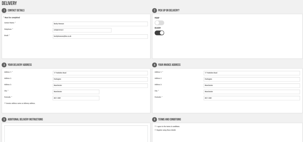
I can't even look at this page without my eyes stinging. There are just so many things wrong here. To name a few:
Improper use of whitespace: Why do you need the field names to be so far away from the fields themselves? Why are you using an entire block for placing two tiny toggles for pickup and delivery? You can create a form containing all of the information here that is at least 4x smaller and much easier to scan.
Improper formatting of fields: There is a telephone field where the digits you type will not appear in the format of a phone number (e.g. +1 (555) 123-1234) to make it easier to read. This is something so common that the majority of design tools even have ready components for it.
Absence of placeholder: You can barely notice that there is a text field in the “Additional Delivery Instructions” section. Moreover, I am not sure what you are supposed to write there. Great form UX always assumes the presence of placeholders that give you a hint, like "Please leave package on front porch."
Do This Instead
The remedies for each of these problems are pretty self-evident, but this is a case where it just seems like the only people who tested this form are the ones who built it. The designers would have been well-served to get some real user feedback on this UX before launching it.
Sin #6: Using The Wrong UI Elements
The next sin I want to talk about is a continuation of the previous one. Forms are not the only UI elements in your product that should follow well-established conventions and best practices. There are also other common elements like toggles, check boxes, and others.
In fact, users already have established mental models for the way each of these elements work and you need to make sure that you are using them the right way.
Here are a couple of examples of what these elements are created for and how not to use them right:
Toggles: This element will show you a “boolean” state (like something being On/Off or Active/Inactive). They are great for showing your users the status of the Bluetooth antenna in their smartphone and letting them turn it on or off.
In the previous form, however, there are two toggles that let the user choose between pickup and delivery.
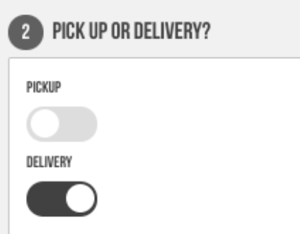
If you think about this for a moment, you'll have thought about it longer than the designer did. These toggles means that you need to turn “pickup” OFF and “delivery” ON to select the “delivery” option! They could have used radio buttons. I honestly wonder what happens if a user toggles them both on at the same time.
Select Menus Without Filtering: Being one of the oldest elements to appear on websites, select menus are still popular and highly user-friendly if used correctly.
Do This Instead
The best practice dictates that you should use a select menu for the cases when the user needs to pick a single option from a list that is 5-15 options long. If there are fewer than 5 options, then you should go for radio buttons.
In case there is an extensive list of options to select from (e.g. 50 U.S. states or ~200 countries), you will need to add filtering to your select menu. Otherwise, your user will have to scroll through that long list in order to find the option they want.
Sin #7: Neglecting Who Your Users Are And What They Want
Finally, the greatest sin of them all: creating a new product with a UX design that does not fit the needs and interests of your users. This is just a recipe for failure.
Do This Instead
Good product design process always starts with user research. Unless you know who your users are and what they need, no matter how beautiful of a user interface you create, you will most certainly end up with a poorly-designed product.
I know that user research is not an easy task. After all, it took Apple years of user testing to achieve an exceptional level of usability in both the industrial design and user experience of their iPhone. However, believe me, it is the single most impactful piece of work that you can do to ensure the success of your product.
It’s Really Easy To Avoid Committing Design Sins
If you work building websites, you are in a better starting position. Why? Because web design tools normally offer templates that already avoid some of the sins listed here. However, no matter if you are a startup developing digital products or an enterprise that builds physical ones (like keyboards or motion sensors), it is actually quite easy to avoid poor design.
As long as your product development process focuses on the needs and pain points of your users and you are using the right product design software, you will be able to avoid significant design flaws and ending up with a badly designed product.
I hope these examples made you feel better about your own products, or at least gave you a chuckle. For more UX tips and other articles for product people, make sure to subscribe to our newsletter!